Now that the Winter issue of Knitscene is hitting newstands and mailboxes, let's take a look at my featured designer collection! Because oh yeah....if you didn't notice, I'm the featured designer of this issue. :) Yay!
From the beginning I decided I wanted to design thematically as opposed to separate pieces--partially for that Project Runway, fashion designer type experience but also because it excited me to create a body of work meant to be shown together. I really like thinking thematically, it turns out, so I have several collections in the works for the future (aka, stay tuned!) The inspiration for this collection is medieval armor and the story of its inception is interesting. Last year I spent a lot of time online dating and as it was the first time in my life I was actively dating and not relationshipping, I purposely set the bar low in terms of who I would accept dates from in order to expose myself to as many different types of people and experiences as possible. I had my general standards, for sure, but I wanted to avoid falling into the trap of only dating my 'type' (men similar to those I had previous relationships with.) Anyways, I wound up accepting a date with a guy and we went to the Higgins Armory Museum, which is now closed so I'm glad I had a chance to see it then! We took a swordfighting workshop and looked at the collection, wherein I got really excited about all the details on the armor and took a bunch of pictures with the express purpose of turning them into designs and he probably thought I was a freak. (But that's okay because for reasons that had everything to do with him and nothing to do with my knitting freakiness, there was no second date.)
 All fancy photos by Knitscene/Harper Point Photography, armory photos by me
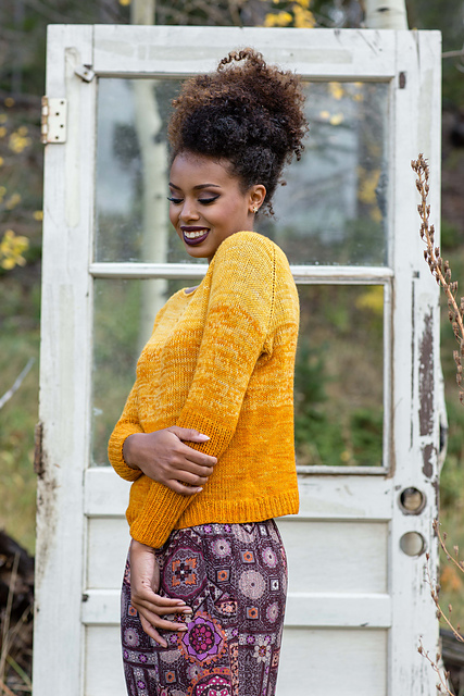
The Haubergeon Sweater is most directly inspired by a specific piece I saw at the Higgins Armory, this suit of armor featuring a lattice-like pauldron (shoulder armor). I instantly saw a lattice cable pattern! I played with different shoulder placements of a cable design but threw some of them out the window for being too bulky, or for encroaching too much on the chest which I knew had the possibility of looking weird on someone with a larger bust than I. Ultimately I mashed up the idea of cabled arms/shoulders with the silhouette of a haubergeon (or hauberk), which is a chain mail shirt, giving this sweater its longer tunic length and the cropped sleeves.

I played more fast and loose with the Gothic Gloves, historically speaking. They aren't directly linked to a specific style of armor, though I drew inspiration from more decorative, mixed-metal pieces and jousting gloves. The cuff shape is very recognizable as being medieval-ish and I approached the mixed metal aspect with two different colors, some stripes and a small colorwork motif. I want to thank Carina Spencer for her Sugar Maple pattern--knitting that piece, with its paired increases and decreases to form the pointed hem without increasing the overall number of stitches, helped me figure out how to shape the point of the cuffs and keep the stitch count consistent.
 The Cuirassier's Cardigan is another more artistic rendition, if you will. I saw several lovely cable-like details on suits of armor at the Higgins Armory and sought to create a simple, everyday cardigan with a few special touches. Something that was less Ren Faire than perhaps the gloves! As such, the only tie this piece has to armor are the flowing lines and small cables which grow out of an otherwise plain background. I-cord edgings are among my favorite because of how clean they are, and I felt that paired with a zipper closure instead of buttons, they helped keep this from looking too knitting-y (where a ribbed buttonband would have taken it away from the original intent.) I like the jacket/blazer feel of this piece, which was entirely unintentional!
 And now, my absolute favorite piece of the collection: Ornate Greaves! Greaves (leg armor) could be quite plain but I followed in the footsteps of more decorative pairs with the kneecap cable design and purl ridges along the calves. This was extra special because I used my friend Laura's yarn, Gynx Yarns Merino DK. I love the above-the-knee length for these, partially because of my love for thigh high socks and stockings! Practically speaking though, it's a great choice for extra warmth and it gave me more space to play with the cable design.
In terms of yarn choice, I had two purposes. The first was to pick companies that represented something to me as a designer, and the second was to create a cohesive color story.
- The Haubergeon Pullover is knit in The Fibre Company Organik, as I used another of their yarns for my first ever Knitscene pattern (the Mountain Nettle Shawl, in Acadia.)
- The Gothic Gloves are knit in Brooklyn Tweed Loft, a company on my knitting bucket list to design for--maybe this will be the first step towards a future collaboration? ;)
- The Cuirassier's Cardigan is knit in Valley Yarns Colrain, as a thank you to Webs and the Elkins. Without my job there I might not be a designer at all, let alone the one I am today with the friends, fans and industry connections I can directly attribute to Webs.
- And the Ornate Greaves are in Gynx Yarns Merino DK, because Laura deserved to be in Knitscene for taking a chance on me in our multiple collaborations, and I wanted the world to be exposed to her beautiful yarn.
When I first envisioned the collection, grey was the color that popped to mind because duh, metal. While a monochromatic, all-grey collection would be really beautiful, I am first and foremost a person that loves color and I wanted to showcase something more 'me', and an all-grey palette would not be fitting. The gloves use a neutral oatmeal and a gold for a warmer play on the silver and gold of mixed metals, and the copper of the cardigan is to represent a different metal--the warmer half of the collection. On the cooler side, we have grey legwarmers because I HAD to have one grey piece and felt a neutral color was more wearable for an accessory like this. The pullover color is a bit of a reach, but I was looking for a cool, elegant color that fit with the rest of the palette rather than being a bright pop. Purple was a sought-after color in medieval Europe, after all!
My biggest goal for the collection was to draw inspiration from armor while creating modern and wearable pieces as opposed to costume items. Because of that, it's not a 100% historically accurate look at medieval armor but I am beyond pleased with the end result. What do you think--did I pull it off? Can you see yourself or someone you know wearing these pieces?
(Many thanks to Amy Palmer at Knitscene for accepting my proposal, the other folks at Knitscene for the fabulous styling of these garments, the yarn companies listed above for their excellent yarn support, and Robin Shroyer for writing a great article about me and for creating possibly the best interview ever!)


 Stone Blue & Paris Night
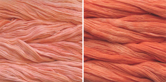 Apricot & Tiger Lily
 Cactus Flower & Molly
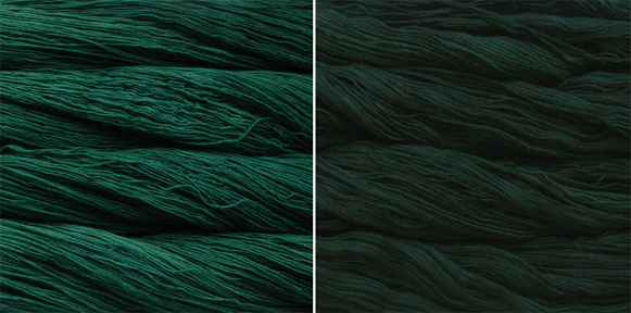 Verde Esperanza & Cypress
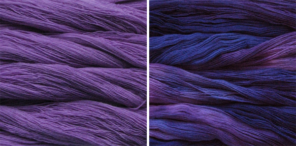 Jacinto & Purple Mystery
 Cognac & Marron Oscuro