
One of my favorite things to do in my part-time gig as LYS employee is to help customers pick out color combinations for multicolor projects. I feel like I have good color sense and my coworkers ask for my opinion on colors which helps reinforce this idea, even if it is all in my head! I tend to go by instinct and don't follow a strict set of rules, though I do keep the varying values of the colors in mind when picking 3 or more for a project. Since I love color, a good number of my designs feature multiple colors and as far as I'm concerned, the quirkier the better! I know a lot of people don't trust their color sense or can have a hard time envisioning a design in other colors, so I thought I'd introduce a mini series on playing with color. Each post will examine a colorful design of mine and I'll showcase some other potential color combinations that I think would work along with tips on how to approach choosing colors for that particular project. Up first is the Gilt Sweater! Since this design relies heavily on an ombre effect, you really need to pick two yarns that are closely related in order to duplicate this same effect. If you always order your yarns online, this can be really hard to do! I would suggest picking out several possible color combinations and then looking at other people's projects on Ravelry in those colors to see how the color reads across multiple cameras and lighting situations. I definitely suggest using a hand-dyed yarn to enhance the color blending, which also means that you have variation across dyelots to contend with. If at all possible, I'd visit a LYS or two and check out colors in person to find the best combination.
Let's take a look at Malabrigo Lace, the yarn called for in the pattern. Malabrigo arranges their colors by family, which really helps in choosing for this project since all the blues are next to each other, the yellows in a separate section, etc. Take a look at the blues.

Often you'll see a perfect combo right next to each other, like Blue Surf & Jewel Blue, Bobby Blue & Tuareg or Tuareg & Azul Profundo (for a darker usage of Tuareg). Other times you'll want to mentally rearrange the colors to find a better pairing, but you can also do so in a computer program like Photoshop or Paint if you're having trouble seeing the two together. Stone Blue & Paris Night are separated on the website and look great together!
 Stone Blue & Paris Night
Try identifying the primary hue in a color that draws your eye, and then look for a lighter or darker version of a color that carries the same hue. IE, if you're attracted to blues that lean green/almost teal, look for another blue that contains green rather than a purpley blue.
Here is a rainbow of color combinations for a rainbow of Gilt Sweaters!
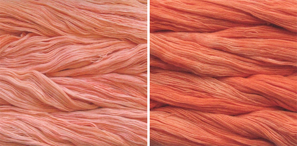 Apricot & Tiger Lily
 Cactus Flower & Molly
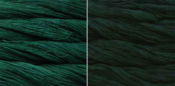 Verde Esperanza & Cypress
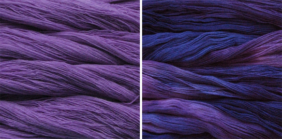 Jacinto & Purple Mystery
 Cognac & Marron Oscuro
Notice that I chose the semi-solid, less crazy colors of Malabrigo. While I think you could successfully make a Gilt Sweater using a more variegated colorway and a coordinating semi-solid, it will be harder to pull off (especially without buying the yarn in person) and the end result will likely be a different looking sweater. That's ok! Just be aware of what look you are creating and swatch heavily, especially if you are trying to avoid an obvious transition line between colors.
Now go out there and show me some fabulous ombre color combinations of your own!