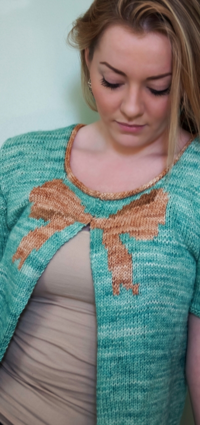
Welcome to another edition of Playing with Color! Today we'll take a look at the Polonaise Cardigan. Let's just start by saying TGFM--thank god for Malabrigo! Or actually, thank god for Malabrigo's well-designed website that often puts perfect color combinations right next to each other. I mean, check out the page for Silky Merino. Hnnnngggghhh!
Photo by Kate Broderick
You'll need to pick three colors for this baby: one main color, and two coordinating colors for the bow detail. The idea is to pick two similar shades for the bow, one light and one dark, to be the body of the bow and its shadows. This is another occasion where shopping in-person is SO helpful. Failing that, if you can somehow get your hands on a Malabrigo color card or if you know someone with an extensive Silky Merino stash who can provide input, you'll be much better served than going in blindly and guessing.
I used Spring Water for the MC and Tatami/Topaz for the bow, as I was going for a cloth-of-gold bow look and thought the Spring Water would provide nice contrast. Here are some other fun suggestions! The first color on the left is the body color and the other two would be the bow colors.
Cape Cod Grey, Camote & Coral for a fresh, modern take
Pollen, Raspberry & Jupiter for an unexpected hint of sweetness
Wisteria, Acorn & Redwood Bark for the sophisticate's closet
Do any of these color combinations inspire you?


