playing with color

Playing with Color: Polonaise Cardigan

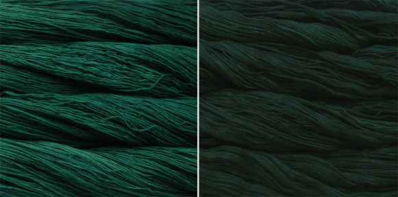
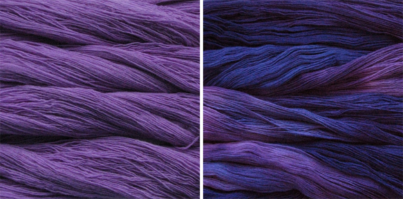
Welcome to another edition of Playing with Color! Today we'll take a look at the Polonaise Cardigan. Let's just start by saying TGFM--thank god for Malabrigo! Or actually, thank god for Malabrigo's well-designed website that often puts perfect color combinations right next to each other. I mean, check out the page for Silky Merino. Hnnnngggghhh!

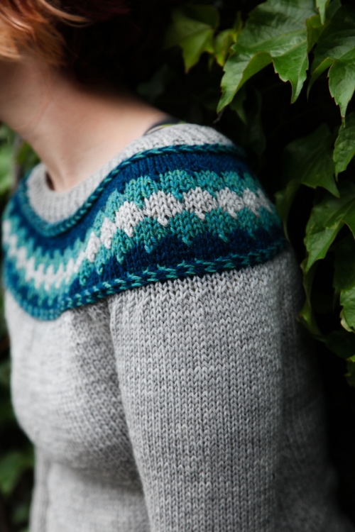
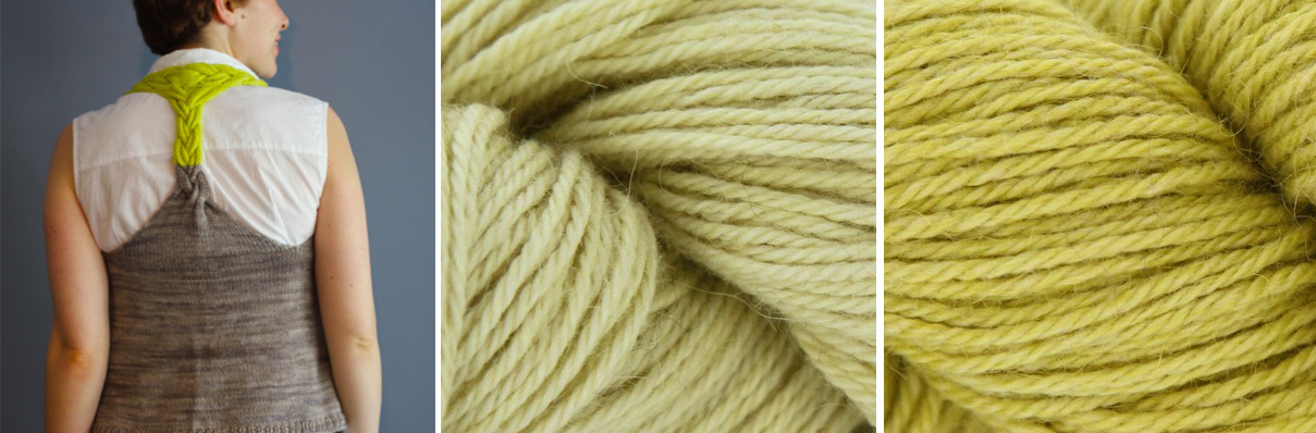
Photo by Kate Broderick

You'll need to pick three colors for this baby: one main color, and two coordinating colors for the bow detail. The idea is to pick two similar shades for the bow, one light and one dark, to be the body of the bow and its shadows. This is another occasion where shopping in-person is SO helpful. Failing that, if you can somehow get your hands on a Malabrigo color card or if you know someone with an extensive Silky Merino stash who can provide input, you'll be much better served than going in blindly and guessing.

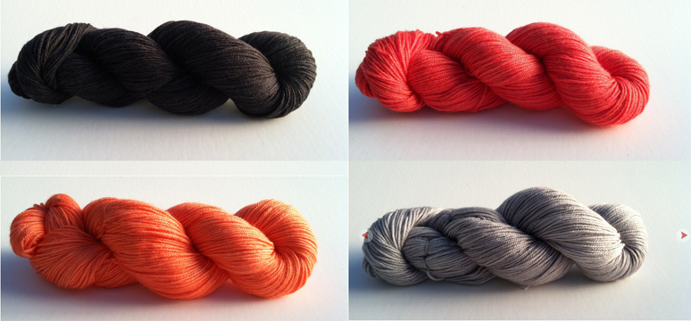
I used Spring Water for the MC and Tatami/Topaz for the bow, as I was going for a cloth-of-gold bow look and thought the Spring Water would provide nice contrast. Here are some other fun suggestions! The first color on the left is the body color and the other two would be the bow colors.

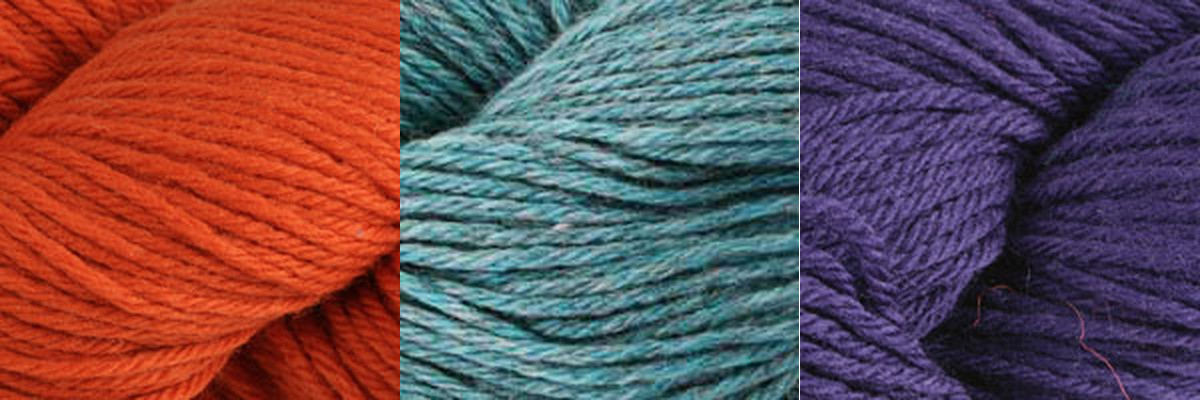
Cape Cod Grey, Camote & Coral for a fresh, modern take

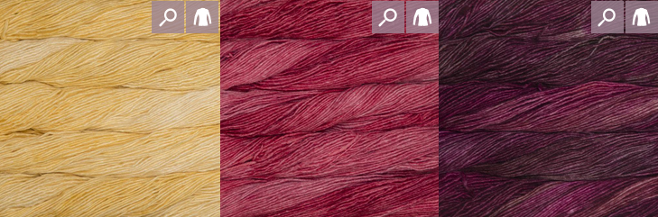
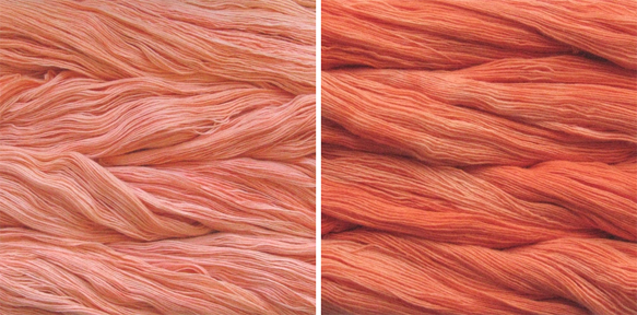
Pollen, Raspberry & Jupiter for an unexpected hint of sweetness

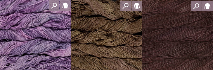
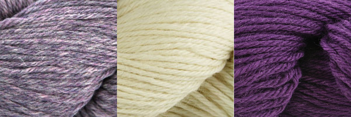
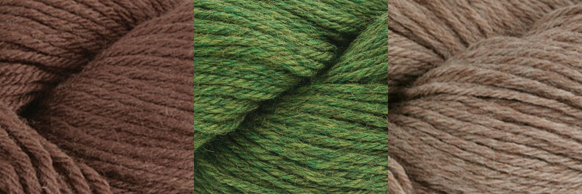
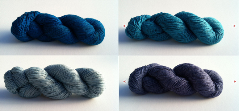
Wisteria, Acorn & Redwood Bark for the sophisticate's closet

Do any of these color combinations inspire you?

Playing with Color: Dreamer's Braided Pullover

I know I know, it's July and you don't even want to THINK about touching a long-sleeve wool pullover. I'm sorry. (Not really.) You might not be ready to start knitting but why not start playing with color options for your future Dreamer's Braided Pullover? Spend the summer months picking out colors and then begin knitting once fall hits! This design was originally published by Valley Yarns in their Sheffield, which is discontinued, so I was given the rights back to publish it myself and I reknit it in Cascade 220. As such, we already have two color combinations of this sweater floating around. I'm going to focus on options in Cascade 220 since it's such a versatile and affordable yarn. For the sample, I chose a palette of grey and aqua/teal leaning blues.

IMG_6545smallestPhoto by Lindsey Topham

One of my favorite things about 220 is the mix of solids and heathers in the color range. Just like mixing in a warm color with cooler ones adds dimension and visual interest, mixing solids and heathers can really spice up the look of your color palette.

You've got lots of options to tackle color for a sweater like this! In all the pairings shown, the center color is the main body color of the sweater. You can choose either accent color to be used for the corrugated ribbing in the hem and cuffs, though in my sample I used the darker color. Of course, you could always work plain ribbing in the MC and have the colorwork be contained only in the yoke of the sweater. (All photos below from Webs.)

Option 1: Neutral MC, two different pops for the CCs

2425 8013 9341From L to R: 2425 Provence, 8013 Walnut Heather, 9341 Garnet Heather

Option 2: Neutral MC, two tonal coordinates for the CCs (same approach as the sample sweater)

9641 8010 7807From L to R: 9641 Purple Tourmaline, 8010 Natural, 7807 Regal

Option 3: Non-neutral MC, two tonal neutrals for the CCs

8686 2429 8012From L to R: 8686 Brown, 2429 Irelande, 8012 Doeskin Heather

For the sake of covering all our bases and bringing these options back to full circle...

Option 4: Non-neutral MC, two different pops for the CCs--this one's for the adventurous!

7824 9452 8886From L to R: 7824 Burnt Orange, 9452 Summer Sky Heather, 8886 Italian Plum

Luckily, there are a ton of colorwork sweater patterns out there, so you can always browse other people's projects on Ravelry and get inspired by their choices! My favorite method is to head to my LYS and start playing with the skeins on the shelves. I always come up with new and unexpected combinations that way and it continually surprises me to see what works together.

Holla Knits Summer 2015 Blog Tour

Hello Holla Knitters and welcome to today's stop on the Summer 2015 issue blog tour! My contribution is a tutorial article 'Deconstructing the Knot Stitch' where I guide you through decreasing in pattern while knitting the knot stitch, seen in Annapolis by Kristen Jancuk.

In the article, I break down the specifics of staying in pattern while working the Knot Stitch and include some helpful tips you can apply to future lace and texture patterns. I know I'm guilty of writing "decrease while continuing to stay in pattern when possible" (ahem, Holla Back Tank!) so it's a great skill to be able to master.

If my exclusive article doesn't sell you on purchasing the issue, what about the designs? As usual, our fearless editor Allyson has selected a group of fresh and innovative pieces that take warm weather knitting to a whole new level. My two favorites are Beach House by Teresa Gregorio and Backbone by Kirsten Singer.

I'm dreaming of a Beach House in HiKoo Rylie, a super gorgeous alpaca/silk/linen blend that I pet almost everytime I'm at work. I love the bright citrusy colors and this would be perfect in a pop of coral.

beach house
beach house

The two color option of Backbone is GENIUS. I would use two coordinating colors of Manos del Uruguay Serena for an ombre effect. The only problem is choosing which color to be the main color!

backbone
backbone

Which design from the Summer 2015 issue is your favorite? Comment before end of day (EST) Friday, July 3 and I'll pick one winner on July 4 to receive a copy of the pattern of their choice!

Check out the rest of the Holla Knits blog tour for styling tips, behind the scenes info on the designers and more giveaways!

June 15: Holla Knits Summer 2015 Launch June 16:The Sweatshop of Love – pattern giveaway June 17:Klever Knits – pattern giveaway June 18: Canary Knits – Travel knitting & mag giveaway

June 22:MediaPeruana – pattern giveaway June 24:YarnGasm – Knitting with Voolenvine Podcast – magazine giveaway June 25:Cosmos and Cashmere – pattern giveaway June 26:Midwest Yarn – pattern giveaway

June 29:Emma Welford – pattern giveaway July 2:Canary Knits – Beach House styling & giveaway

Playing with Color: Stripe Quartet

Let's dive into another color-driven design, shall we? Stripe Quartet is a great simple, stripey cardigan using Baah Aspen. Mira (of Baah) and I picked out the colors together at TNNA last May and it was wonderful that we had similar thoughts. I'm super pumped she let me throw that orange in there because I love orange! There are two ways to approach a project like this, in my opinion. First is to use two neutrals and two color pops, which is what I did with my sample using two greys, hot pink and orange. There aren't many neutrals currently in the Aspen color line, so let's pick out a few different color pops that could be subbed in using the same greys as I did, Shadow and Grey Onyx.

coralreef sirenaClockwise: Shadow, Coral Reef, Grey Onyx, Sirena

I'm really digging that Coral Reef color! But how does it look with other 'pop' colors?

coralreef pecheClockwise: Shadow, Coral Reef, Grey Onyx, Peche

coralreef fuchsiaClockwise: Shadow, Coral Reef, Grey Onyx, Fuchsia

Sirena and Fuchsia are the more startling/weird color combinations with the Coral Reef but come on, I like weird! If you're going to do a four-color striped sweater I say have fun with it and go outside your comfort zone. :) Peche and Coral Reef is a tonal, more muted version of the original sample. Each of these combinations has a mix of warm and cool colors, which I think is important to consider when knitting multi-color designs. (Shadow, Grey Onyx and Sirena: Cool; Coral Reef and Peche: Warm; Fuchsia: Debateable.)

Another way to approach this project is by picking 4 shades in the same color family for a more gradient effect with less contrast. This option is dependent on your yarn of choice having lots of colors in the color family of your choice, and Aspen is somewhat limited here--you can't do an all-yellow Stripe Quartet, but not many dyers offer a multitude of yellows anyway!

bluetopaz sirena navy skyClockwise: Blue Topaz, Sirena, Navy, Sky

These four blues create a balanced pairing since the top row features warmer blues with turquoise/teal influences and the bottom two colors are straight blues, almost a little greyed out. A great example of warm/cool mix while staying in one color family.

amethyst fuchsia aubergine violetClockwise: Amethyst, Fuchsia, Aubergine, Violet

Another beautiful and subtle palette that combines warm and cool purples of all hues!

Which way do you prefer your stripes--funky and off-beat or tonally united?

Playing with Color: Gilt Sweater

One of my favorite things to do in my part-time gig as LYS employee is to help customers pick out color combinations for multicolor projects. I feel like I have good color sense and my coworkers ask for my opinion on colors which helps reinforce this idea, even if it is all in my head! I tend to go by instinct and don't follow a strict set of rules, though I do keep the varying values of the colors in mind when picking 3 or more for a project. Since I love color, a good number of my designs feature multiple colors and as far as I'm concerned, the quirkier the better! I know a lot of people don't trust their color sense or can have a hard time envisioning a design in other colors, so I thought I'd introduce a mini series on playing with color. Each post will examine a colorful design of mine and I'll showcase some other potential color combinations that I think would work along with tips on how to approach choosing colors for that particular project. Up first is the Gilt Sweater! Since this design relies heavily on an ombre effect, you really need to pick two yarns that are closely related in order to duplicate this same effect. If you always order your yarns online, this can be really hard to do! I would suggest picking out several possible color combinations and then looking at other people's projects on Ravelry in those colors to see how the color reads across multiple cameras and lighting situations. I definitely suggest using a hand-dyed yarn to enhance the color blending, which also means that you have variation across dyelots to contend with. If at all possible, I'd visit a LYS or two and check out colors in person to find the best combination.

Let's take a look at Malabrigo Lace, the yarn called for in the pattern. Malabrigo arranges their colors by family, which really helps in choosing for this project since all the blues are next to each other, the yellows in a separate section, etc. Take a look at the blues.

blues

Often you'll see a perfect combo right next to each other, like Blue Surf & Jewel Blue, Bobby Blue & Tuareg or Tuareg & Azul Profundo (for a darker usage of Tuareg). Other times you'll want to mentally rearrange the colors to find a better pairing, but you can also do so in a computer program like Photoshop or Paint if you're having trouble seeing the two together. Stone Blue & Paris Night are separated on the website and look great together!

stoneblue parisnightStone Blue & Paris Night

Try identifying the primary hue in a color that draws your eye, and then look for a lighter or darker version of a color that carries the same hue. IE, if you're attracted to blues that lean green/almost teal, look for another blue that contains green rather than a purpley blue.

Here is a rainbow of color combinations for a rainbow of Gilt Sweaters!

apricot tigerlilyApricot & Tiger Lily

cactusflower mollyCactus Flower & Molly

verdeesperanza cypressVerde Esperanza & Cypress

jacinto purplemysteryJacinto & Purple Mystery

cognac marronoscuroCognac & Marron Oscuro

Notice that I chose the semi-solid, less crazy colors of Malabrigo. While I think you could successfully make a Gilt Sweater using a more variegated colorway and a coordinating semi-solid, it will be harder to pull off (especially without buying the yarn in person) and the end result will likely be a different looking sweater. That's ok! Just be aware of what look you are creating and swatch heavily, especially if you are trying to avoid an obvious transition line between colors.

Now go out there and show me some fabulous ombre color combinations of your own!